
Creating Products that Include Spatial Data
This page provides guidelines for creating products (data sets, web sites, reports, papers, posters, and maps) that include spatial data. These are meant to help students produce professional products quickly.
It is impossible to address all the issues associated with products here so please refer to my Writing Tips pages and the book "Cartographic Elements" for additional information.
Data sets
Spatial data sets should be distributed in formats that are open standards and in common use. I recommend the following:
- Point data:
- Comma Separated Value (CSV) or Tab-delimited text files
- Shapefiles
- Non-point vector data (polylines/linestrings or polygons/linerings):
- Shapefiles
- Raster data:
- IMAGINE (IMG) files for compatibility with ArcGIS and other products
- Georeferenced Tagged Image File Format (GeoTIFF)
Spatial data sets that are to be provided to others should always include metadata with the following information:
- Organization and/or author of the data set
- Date of creation
- Person to contact for additional information
- Any usage restrictions (i.e. free to use for any purpose, confidential, etc.)
It is also highly desirable that the metadata include:
- How the data was created (both collection of original data and processing steps)
- Information on the uncertainty of the data (precision, accuracy)
Publications - General
Publications can be in the form of reports, papers, posters, and maps. Some requirements vary with the type of publication while other should be adhered to throughout.
In all publications, you should ask "who is the audience?" and "what do they need to know to understand what I am trying to communicate?".
General requirements for publications are:
- All text should be easily readable. For any type of document, the text should not be below 9 point fonts.
- There must be padding between borders, including "neat lines", and contained and surrounding content.
- Publications should be professionally written with proper structure, grammar, and language. If you need help with this find someone who is good at writing and have them review your documents.
- Everything should look professional, clean, and be attractive. If you struggle with this, find someone who creates great looking documents and ask them to review yours.
Spatial Data
A "map" contains spatial data and needs to include the map elements below unless there is a reason not to include particular elements. However, in some cases, similar maps may be presented together with a common north arrow, legend, and scale bar to reduce "clutter" and make additional space available.
- North arrow: unless it is obvious to all readers that which direction north is from the map. A north arrow would not be required for whole earth maps and typically would not be needed for a map of the US. However, a map of Oregon may be viewed by readers from the east coast or outside the US so state-level maps do need north arrows.
- Scale bar: unless the scale is obvious and readers will not be taking measurements from it. Again, with a world map a scale bar is not needed, but with one of Oregon it would be.
- Locator map: should be included unless the area is large enough for all readers to recognize immediately.
- Legend: Should be easy to read, have spacing between the legend contents and it's border, and represent the symbology used on the map accurately. Remember to rename the elements of your legend from their default file names and never have "underscores" in the legend!
- Information on:
- Data sources and the spatial reference (projection, datum, and units).
- Date of creation
- Author and/or the organization that created the map
- Any associated text that is required to define the contents of the map.
Maps are figures in documents and need to include a title or caption as such.
Additional tips for maps:
- North arrows should point north (see David Cade's example below under "Maps") based on where they are located on the map.
- Scale bars should be correct based on the spatial data they are over or close to. Since the scale can vary in different areas of map, this means you may need a different scale bar if you move it.
- Legends should NOT include underscores or other extra punctuation. Legend entries should be renamed to be informational and attractive to the user.
- Legends should have padding around their contents.
- Numbers should have the appropriate number of "significant digits". This means you should never have a number like "33.454356789878".
Don't hesitate to redo work that is not the required quality. If you have to include an old map as a reference and cannot redo it, make sure you mention in the caption that this is a copy of an original map and why it was included instead of being redone (i.e. "The original map is included because the spatial data is not available").
Posters
There are two main types of posters, "academic" posters and posters you might see on the wall of natural resource office or posted at a park. Both of these products are meant to be viewed from a few feet away. This means that all text and diagrams must be readable from a few feet away. The text on a poster should not go below 14 point!
The greatest challenge with posters is how to reduce down the amount of information to fit on the poster. Do not feel like you need to put everything into a poster, just hit the main points so readers get an overview of the content.
Posters are best created in a presentation package like MS-PowerPoint. You can export map elements from ArcGIS and other packages and then insert them into PowerPoint. You can change the "Page Size" of the PowerPoint presentation to be any size from 8.5 x 11 to large posters of 56"x48".
Before printing a poster to a large-format printer it is best to talk to the IT support folks as these printouts can be very expensive.
Academic Posters
These posters are presented at conferences by researchers. Typically posters have a title at the top and then a series of boxes following the traditional sections used with scientific publications (Background, Methods, Results, Discussions and/or Conclusion). They will also contain a block of references which can be combined with the data sources. The references an sources can be smaller than the desired 14 point text.
 |
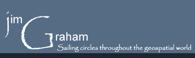
Short-tailed Albatross Distribution in the Bering Sea
By Amelia O’Connor and Seth Wiggins |
Other Posters
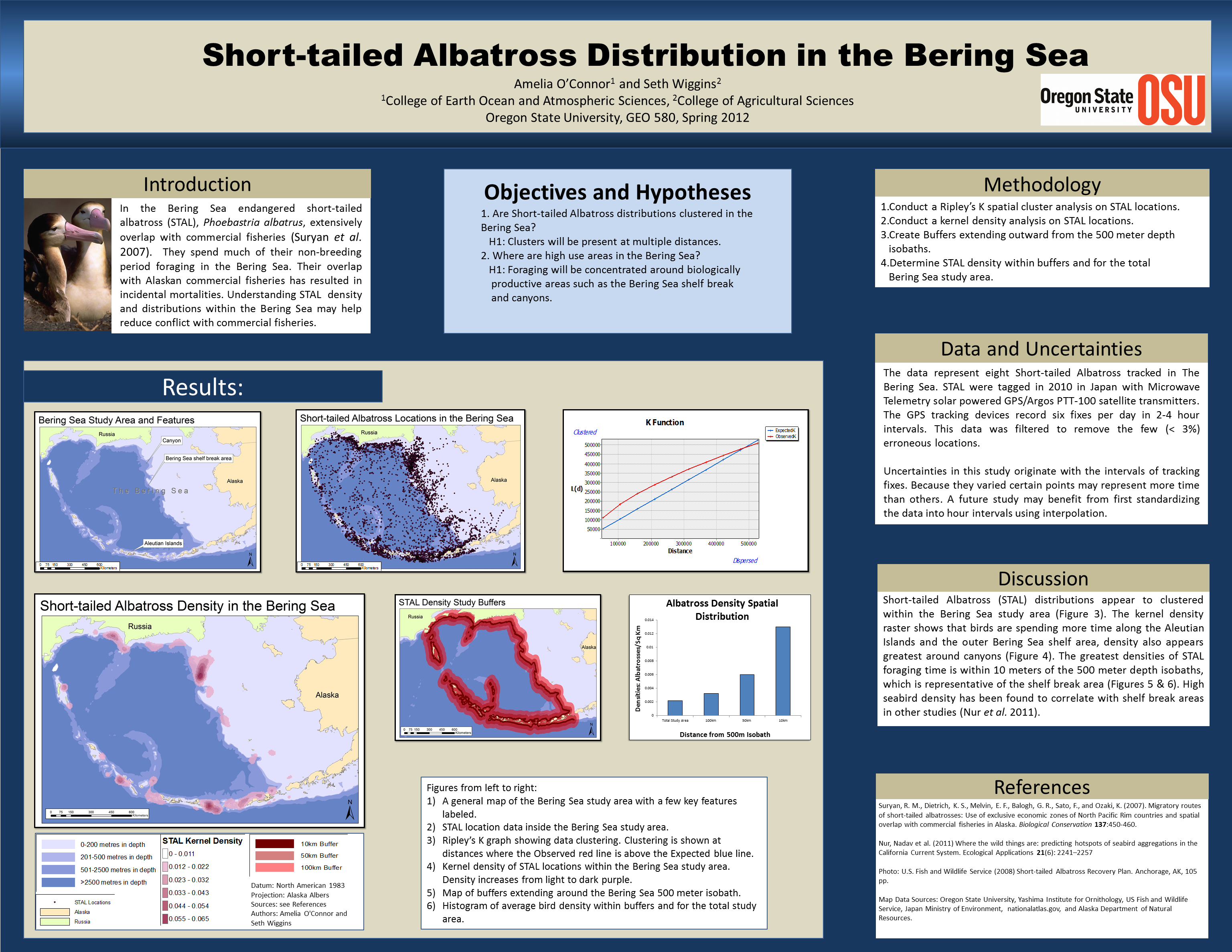
Other posters can be of a large variety of topics and layouts. The National Geography "maps" that appear in their magazine are some of the finest examples of posters with spatial content. Below is one example from a student.
Notice that these posters do not have to follow the research sections but should select a layout that is attractive and communicates the content in a meaningful way.
 |
The Gulf of Mexico: Oil Emphasis By Jake Nelson |
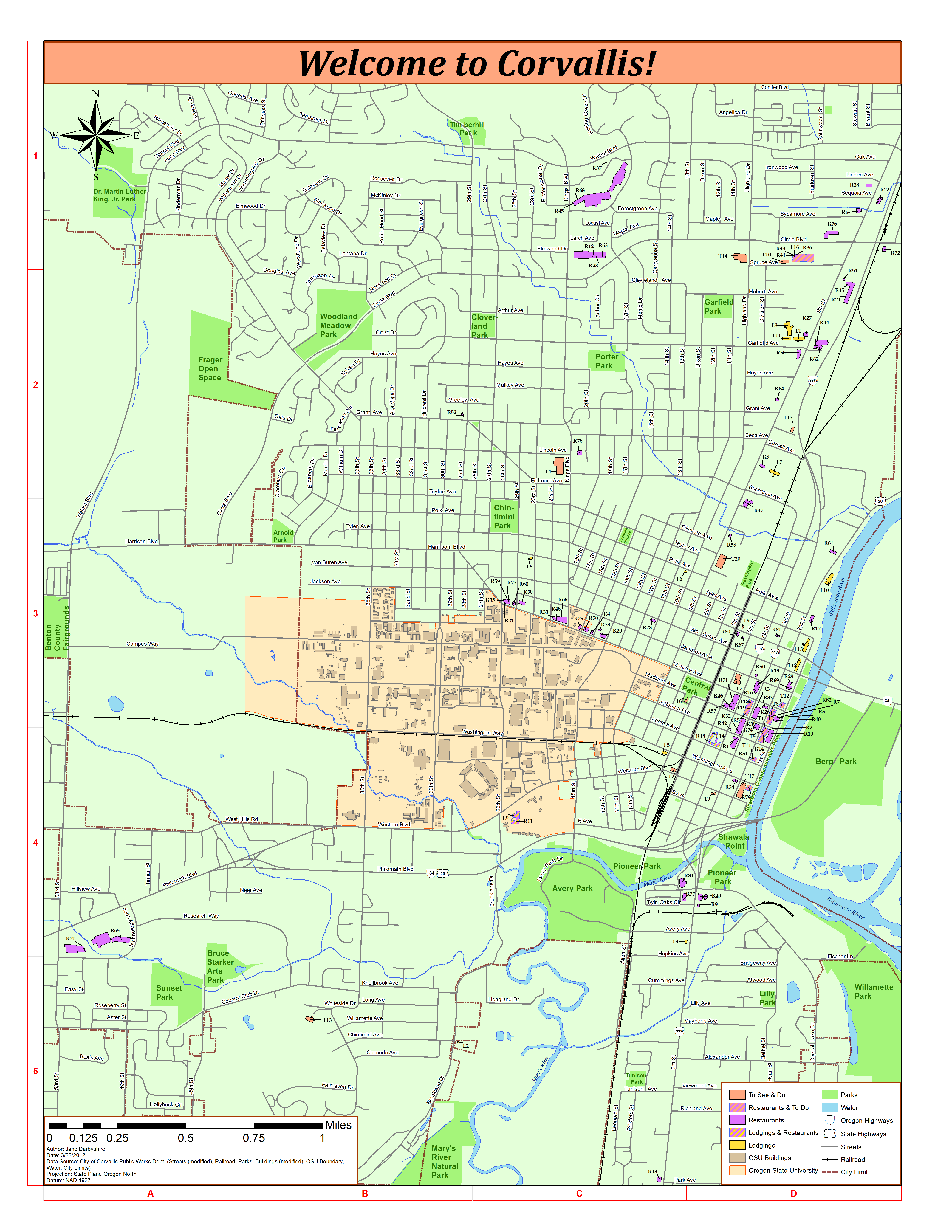
Paper Maps
A true paper map is one that someone might take with them as the explore an area or find their way to a destination. Because of this, the format and content change. The level of detail on these maps is typically higher and the font size can be smaller to help add information and because the reader can hold the map closer than a poster. Still, no text should be below 9 point and 11 points is more comfortable to read. These maps should include all the standard map elements. Many maps are only black and white to make them less expensive to produce.
 |
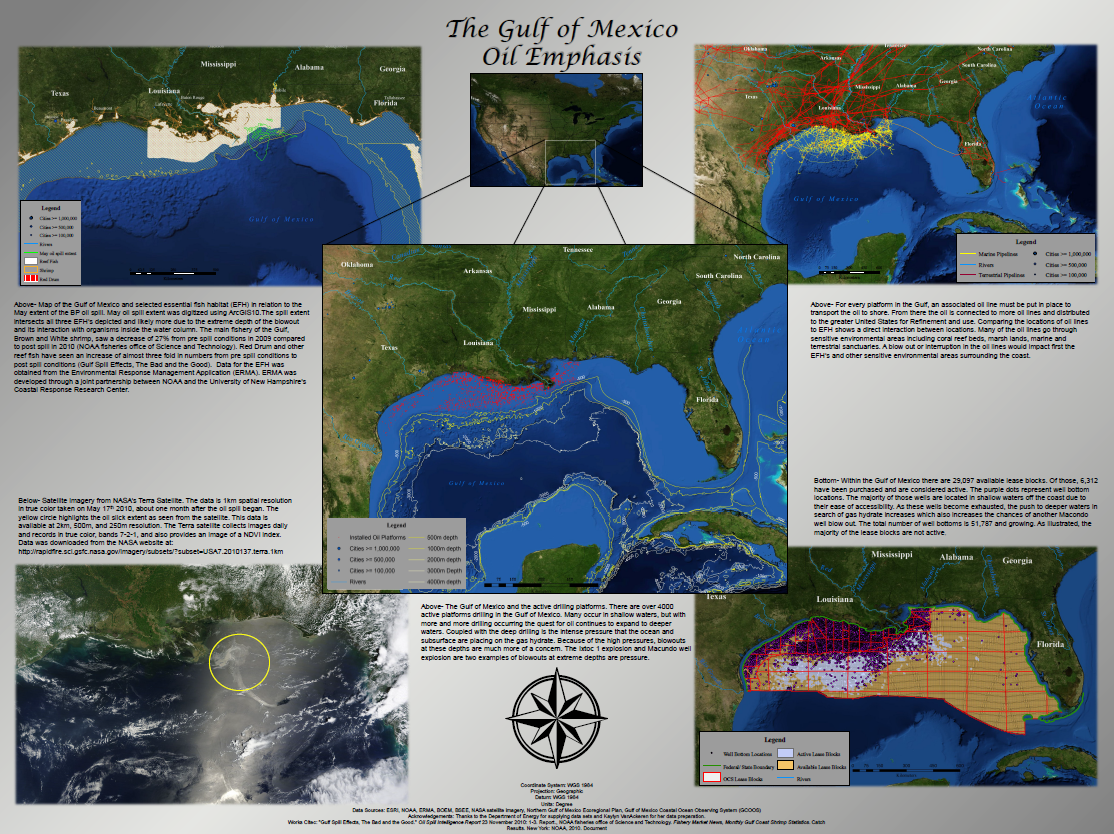
A Map of Corvallis Oregon
This map shows how label placement can be improved by individually positioning labels in software like PowerPoint or Adobe Illustrator rather than using automatically placed labels. |
Reports and Papers
Reports and papers are one of the most common forms for spatial data. Thousands of reports and papers are written every year by GIS professionals. Typically, these documents are printed on 8.5"x11" paper. The maps within these reports can take an entire page but most of the maps will be 1/2, 1/4 of a page or even smaller. This means the maps must be simpler than other formats and broken up to match the content of the text they are close to. Each map should have a caption below it describing its content. Typically one regional map is sufficient for a report or paper and is typically near the start of the paper to help set the context.
To make your maps look good when printed, you need to set the correct "resolution" for your maps. Resolution is a combination of the dimensions of any image (including maps) and the "dots per inch" in a map. When you multiple the dimensions of an image times the dots per inch you will find the number of pixels contained in the image in each direction. In ArcGIS, the dimensions of the map are set by sizing it in layout view and the dots per inch are set when you "export" the map. The "Export" dialog will also show you the final pixel dimensions of the image.
For additional information on writing scientific papers, and papers in general, see the "Writing Tips" section of this web site.
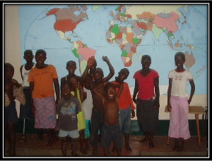 |
How does social vulnerability to climate change spatially correspond to land cover in Ghana, West Africa?
By Sophia Polasky Lauer |
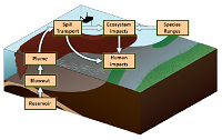 |
Integration of Spatial Data to Support Risk
By Jim Graham et. al. |
Web Sites
There are thousands of web sites that contain very fancy maps and unfortunately, most of them are very hard to use.
Maps on the web must be even simpler than those in papers because the area for the maps are small but screen resolution is only about 100dpi as opposed to 300-1200dpi for printers. This means the content must be broken up and tied together in a way that will make sense to users. You can make simple "clickable" maps using HTML Image Maps. Then, when the user clicks on an area of the map, you can take them to another web page with more information on the area they clicked on.
It's good to use PDF files for users to download for printing but don't use them for users to read spatial data on the web site as PDFs require special software that not everyone may have, they can take a long time to download, and they are just harder to use than simple images.
Map of Where OSU Students Come From by Brooke Marston