Creating Reports in MS-Word
The material below will show you how to create a report in MS-Word that includes spatial information.
Introduction
Microsoft Word is the most popular software application for creating office documents within the United States.
Here is an example of a simple report created in MS-Word with comments to help you create a similar report.
Data
Below is a sample dataset that can be used for this lab or you can use your own data.
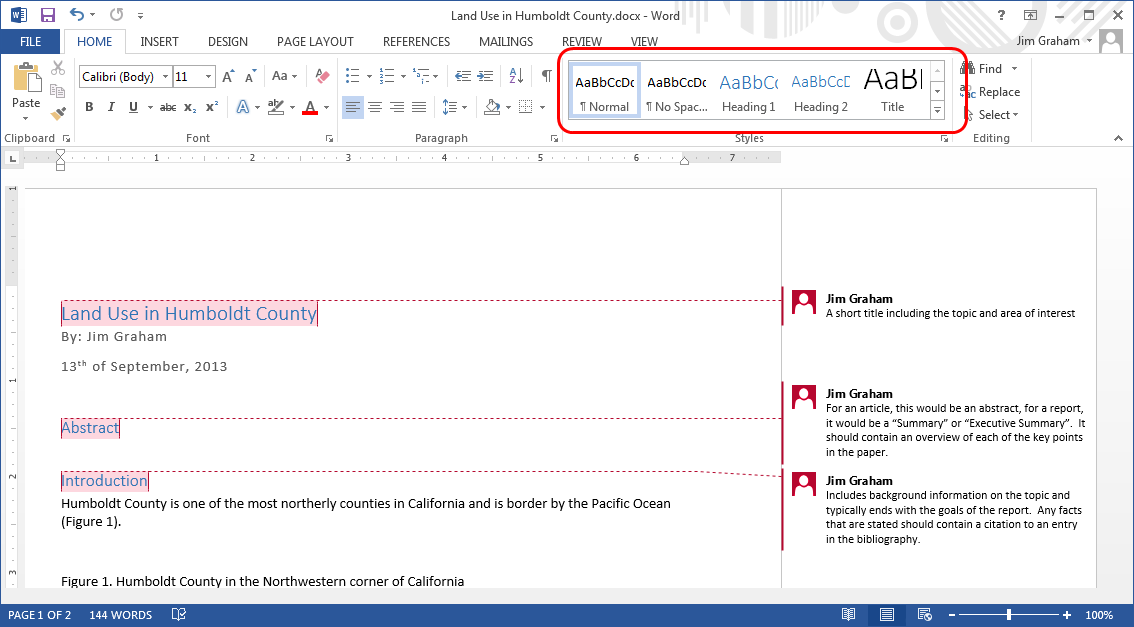
Selecting a Style
Being your report with a concise title that gives the purpose of the report and the name of the location of interest. Then, select the title with your mouse and select the "Title" style from the "Home" tab. Just below the title type your name and the current date. Select this new text and then select the "Subtitle" style.
Using styles will give the elements in your documents a standard set of font characteristics. More importantly, later on you can try different overall styles and they will be applied to your entire document. Using the appropriate styles for the content of your report will also allow help disabled individuals use automatic document readers to read your report.
- Now type "Abstract", select this text and select the "Heading 1" style. Abstracts, also called "Executive Summaries", are short summaries of the entire report. Abstracts only appear in relatively long documents and are written after the entire document has been completed.
- Type "Introduction" and again, select the "Heading 1" style. The "Abstract" and "Introduction" are sections within your overall document. Add section headings for "Methods", "Results", "Conclusion", "Acknowledgments", and "Bibliography".
- Click on the "DESIGN" tab in MS-Word and then try some of the different "Styles" for your document.
The sections below will lead you through creating the rest of the material.
Content
Front Matter
The front matter includes a title, your name as the author, and the date the report was written.
Abstract
Don't write the abstract yet! Instead, write it after the rest of your report is completed. The abstract should contain at least one sentence that summarizes the report from the Introduction to the Conclusion.
Introduction
The introduction introduces your topic to the reader, establishes the background for your methods, and poses your objectives, goals, or hypothesis. All statements of fact (i.e. "grizzly bears once inhabitant most of the Western Continental United States but are now limited to small geographic regions) must be accompanied by a citation for the source of the fact. Citations need to appear in the "Bibliography" section and it is easiest to do this as you create the introduction.
- Provide any background needed to inform the reader of your topic
- Provide background to support the methods you'll be using
- End with a statement of the objective/goals/hypothesis that the study will attain or provide.
Methods
The methods section describes the steps that were used to conduct the research. The content of this section varies with each report but can include:
- Description of the study site, with a map if needed
- How data was collected including manufacturer and model of equipment used
- How the data was qualified for the study
- The analysis methods that were used along with the manufacture and version of any software. Equations should be created with the MS-Word equation editor.
- The methods for final production of the products including this report and data sets
There should be enough information for someone else, with the same level of skill, to recreate your study but you do not need to include specific steps within a software package (e.g. you don't need to state "I selected the Buffer tool in ArcMap and set the buffer distance to 10 meters", "I buffered the data to 10 meter" is fine).
Results
The results section contains what was discovered during the study. This often includes maps showing the results and tables of figures from analysis. Results should start with prose and just describe the results and not discuss or interpret them. Typically each paragraph will describe some results and include references to figures and/or tables. Then the figure or table follows the paragraph. This is repeated for all the results. Changes to the methods that occurred during the study should be included in results.
Conclusion and/or Discussion
All documents should have a "Discussion" and/or a "Conclusion" section. Longer reports will contain both. Technically the discussion contains concerns about the methods and results, potential areas for improvements, and the wider ramifications of the results. the first sentence of the conclusion should state the major results of the study followed by the next steps the researcher feels should be taken to improve or expand upon the results.
Acknowledgments
This is an optional section but should be added if the sponsors of the report are not part of the organization that created the report or if data and other work were contributed by folks not mentioned as authors. This should include field personnel and anyone who helped in the preparation of the data and/or report. Simply thank each person or organization that contributed and their contribution to the report.
Data sources should be acknowledged here unless mentioned elsewhere in the document.
Bibliography/References
The entries in the Bibliography are referred to as "Citations" and most organizations have a standard format that they use for citations. For now, you can use a format that contains the following items in the order shown:
- Primary authors last name followed by their initials. If there is no author, use a short name of the organization that created the material (e.g. "NASA").
- Any secondary authors with their initials followed by their last name (i.e. reverse order of the primary author).
- The year the material was published.
- The full title of the material.
- The source of the material. This is the publisher for books and articles and would be the full name of the organization that created the material for others (e.g. "National Aeronautics and Space Administration").
- Detailed information o the location of the material. This would be a URL for web-based content, the chapter and page for books, and the volume and page numbers for articles.
- You can also include a "Digital Object Identifier" (DOI) if available.
Citing Web pages
Today, we have to cite websites because much of our data comes from the Web. This is frowned upon in some journals. The alternative is to put the data source into the prose but this can make the text hard to read. Another option is to use a website like "tinyurl" to convert the URL to something smaller but this removes the name of the organization from the URL. Over the last few years, it does appear a standard format is emerging and becoming standardized. Please use this format:
Title of home page. Date of publication. Edition. Place of publication: publisher; [date updated; date accessed]. URL.
- Title of home page: required
- Date of publication: optional, If not available, use the current year.
- Edition: optional
- Place of publication: optional
- Publisher:required. Should be the organization sponsoring the web site, not the one that maintains the website.
- Date updated: optional
- Date accessed: required
- URL: required. A reader should be able to click on the link and go to the web page you took information (or data) from.
You would then cite the web page in your text as (Title of Homepage, Year of publication). The title should be abbreviated to just a few words.
Examples include:
- Humboldt County GIS Data Download. Humboldt County; [9/5/2017]. http://www.humboldtgov.org/276/GIS-Data-Download
- WorldClim - Global Climate Data. WorldClim; [9/5/2017]. http://worldclim.org/version2.
- EarthExplorer. U.S. Department of the Interior U.S. Geological Survey. [7/31/2017, 9/5/2017]. https://earthexplorer.usgs.gov/.
These would be referenced as:
I used the Humboldt County Boundary (Humboldt County, 2017) to crop the LandSat data from March of 2017 (EarthExplorer, 2017) and the WorldClim Bio1 layer (WorldClim, 2017).
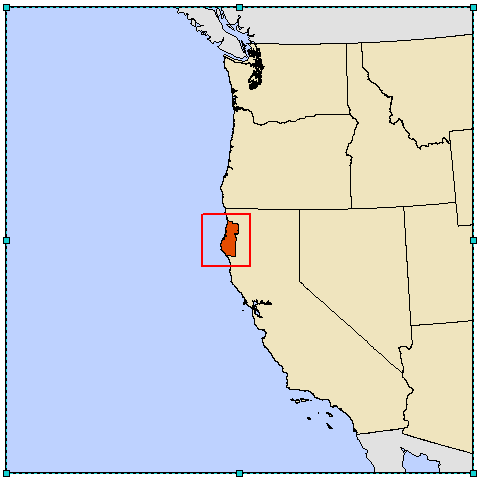
Adding a Locator Map
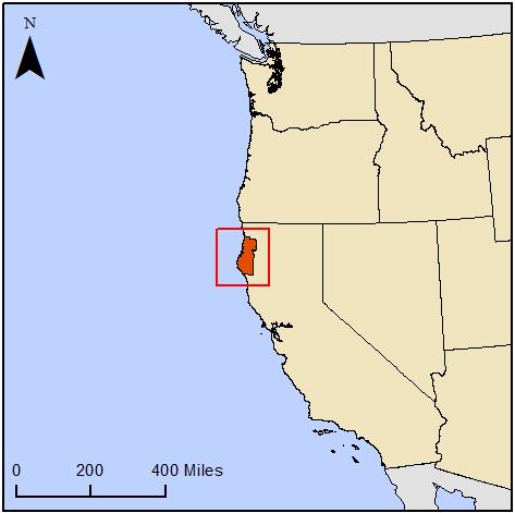
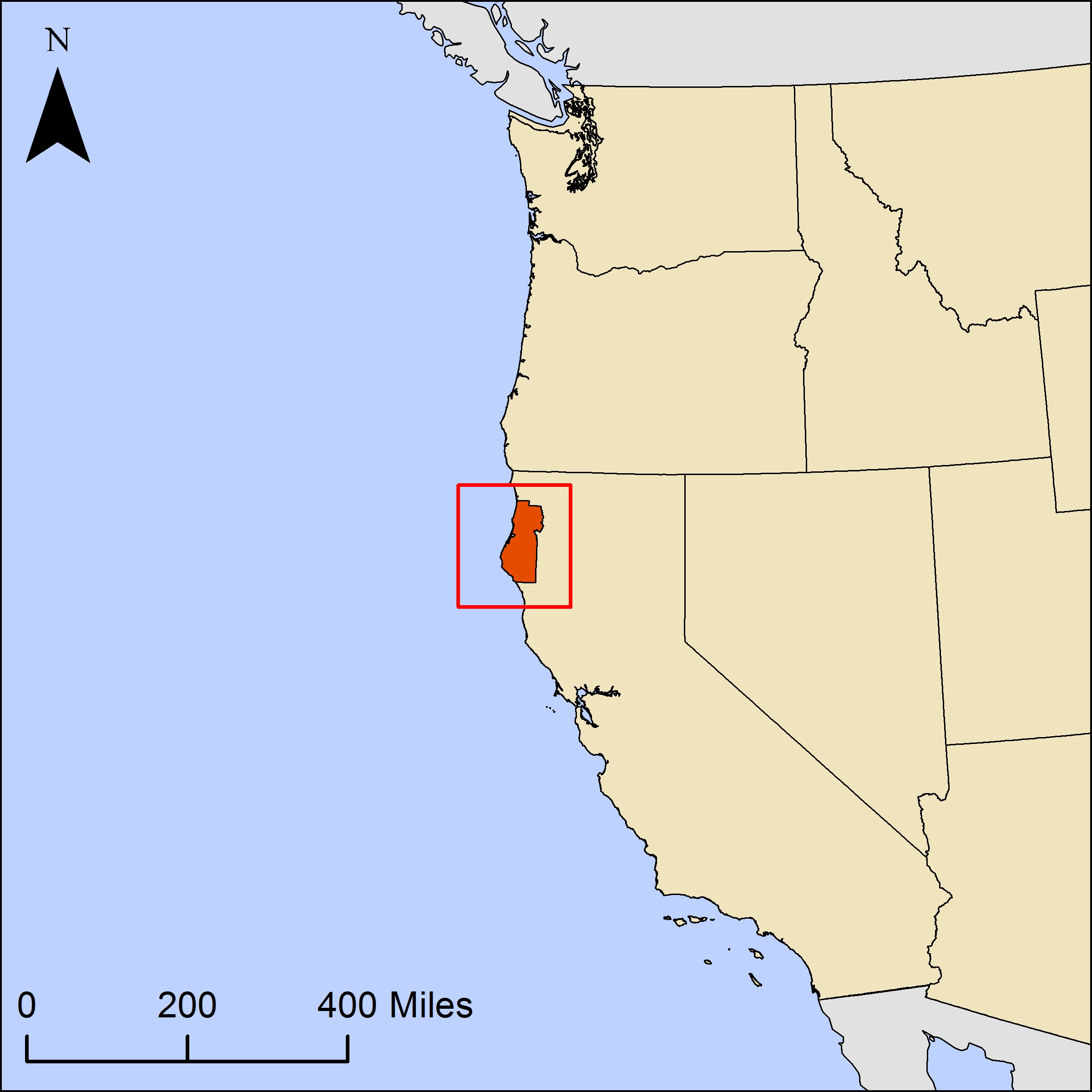
If you were from Humboldt County, you might recognize the map below. However, if you are some somewhere else, or were just not familiar with the shape of the county, you might struggle to know where the map was located. Providing a "locator" map allows the reader of a map or report to immediately recognize where they are.
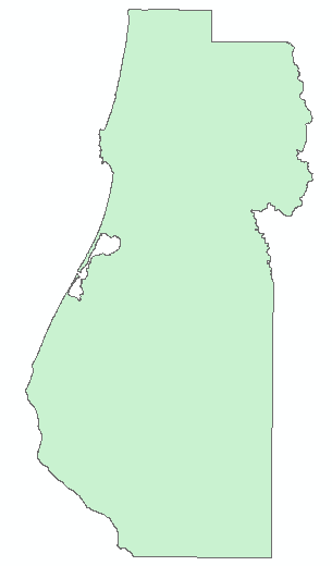
The Island of Humboldt County?
Creating the Locator Map in ArcMap
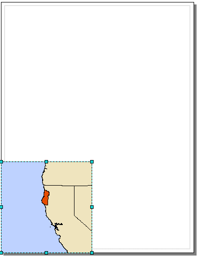
- To start, download the data from the "Data" section above and drag all three files into ArcMap.
- 2. In the "Table of Contents", put the Humboldt County layer on top, then the US States, and then the countries layer. You can turn off the US counties and/or remove it.
- 3. Give the Humboldt County layer a relatively bright color that helps it stand out. Here we've used a bright orange-red, but if your paper is on an environmental topic, you might want a nice bold green instead. The easiest way to change the color is to click on the colored box below the name of the layer in the "Table of Contents" and then click on the box next to "Fill Color" and click on a new color.
- You can use the same steps to change the colors for the "countries" layer to a gray color to de-emphasize Mexico and Canada.
- Switch to "Layout view" in the "View" menu if you’re not already there.
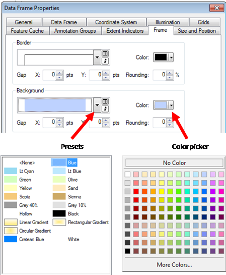
- Right click on "Layers" and select "Properties".
- Change the "Background" color to a nice blue to represent the ocean.
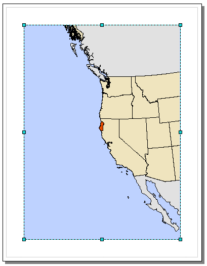
Adjust your zoom levels if necessary, so you can see a little bit of Canada and Mexico, with Humboldt County roughly centered in the frame.
You should have something like the following appearing in your view:
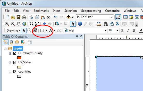
Setting the Size of the Map
Getting a map to look good and be the size want in a report can be a challenge with ArcMap. If you follow the steps below, you should get a good result every time:
- In "Layout View", right click on "Layers" and select "Properties"
- Click on the "Size and Position" tab
- Set the "X" and "Y" "Position" to be 0.
- Set the "Width" and "Height" in the "Size" box to be the final size that you want the image to be in MS-Word. In this case, we've made it 4" x 4".
- The image will appear in a corner of the page.
Now we need to make the page fit the map.
- In the "File" menu, select "Page and Print Setup".
- Uncheck "Use Printer Paper Settings" in the "Map Page Size" box.
- Change the "Width" and "Height" to be exactly the same as what you entered in the Layer Properties dialog.
- When you click "OK" the page and map should be exactly the same size.
Position the Map Contents
Use the zoom in, zoom out, and panning tools to position the map with Humboldt County near the middle of the map and with a portion of Canada and Mexico visible. Each map you create will be a little different because of the shape of the features. You'll want to put the main content in the middle and typically a bit above center. Everything else in the map should be around this and add information but not distract from the main content.
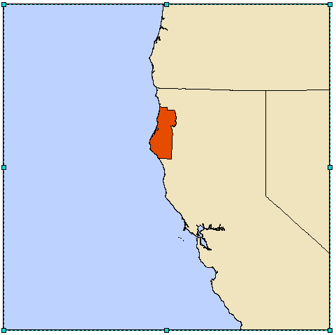
If you want to highlight the target area, you can draw a box around it.
- Select the "Rectangle Tool" from the tool bar.
- Draw the box where you like using the mouse.
- Right click on the box you've created and select "Properties"
- Change the "Fill Color" to "No Color" and the "Outline Color" to red.
- When you click OK, your map should look something like the following:
Adding Map elements
Map elements are important to help orient your reader to the scale and placement of your data. They should not draw attention away from the focus of the map, however, so be subtle.
Adding a North Arrow
You only need to add a north arrow if the target audience will not immediately know which direction is north. In other words, you never need a north arrow if you map is of the entire world. However, if your map is of a small area, you'll always need a north arrow. Since we don't know who will be reading our report, we should add a north arrow to our locator map.
- From the "Insert" menu, select "North Arrow".
- Pick something simple, and with the "N" at the top. (Generally, map makers put the N above the arrow, and engineers and planners put it below the arrow.)
- Drag the arrow into position somewhere out of the way of the main map pieces.
- Make sure the arrow is large enough to see but not too large to distract from the focus of the map.
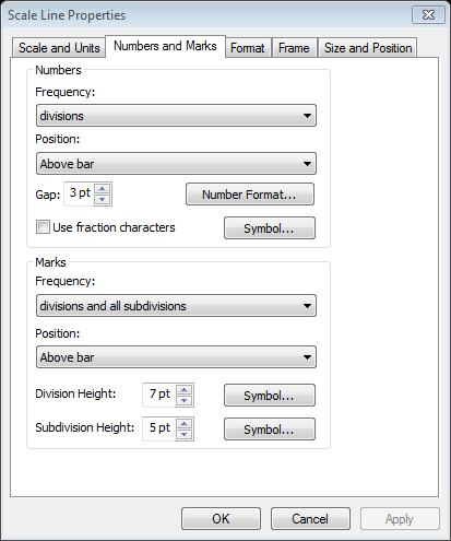
Adding a Scale Bar
- From the Insert menu, select Scale Bar. Again, choose something simple.
- For this small map, we'll need to remove some of those tick marks and numbers to keep it clean and legible. Right click on the scale bar and select "Properties".
- Under "Scale and Units", set the "Number of divisions" to 2 and "Number of subdivisions" to 0.
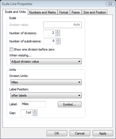
- Under "Numbers and Marks", set "Frequency" to "divisions" only.
- You'll want your scale bar large enough that it is easy to read the numbers but small enough to be unobtrusive.
- Make sure when you drag it that the ending number is something nice and round (for example 250 rather than 240, or 1 mile rather than .75).
Adding Maps to MS-Word
There are many problems that can crop up when putting maps into MS-Word. If you follow these steps, your maps will look good and will not stop you from editing the rest of your document.
Select "Export Map..." from the "File" menu and save the map at at least 300dpi to a "JPEG" file. This is a minimal resolution for desktop printing. Professional printing presses can go as high as 1500dpi but this makes for very large files.
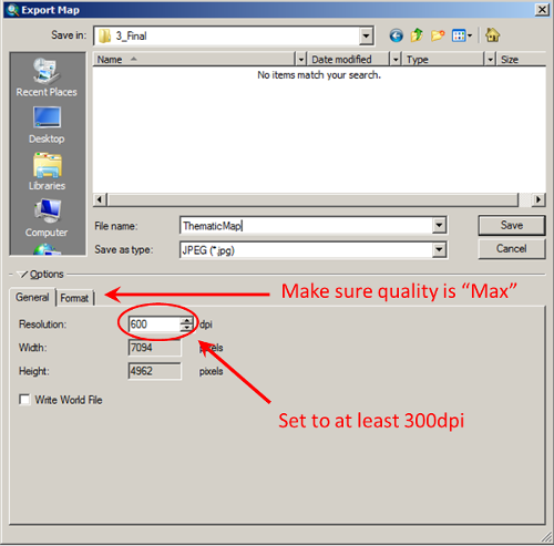
The image below was exported from ArcMap and then scaled down to fit on this web page. We can't show you a 600dpi map on the web because the screen will not support it. However, if you click on the map, you'll see just how detailed the map it. If you follow these steps your maps will look great when you print them from MS-Word.
Bringing the Map into MS-Word
- In MS-Word, click in the report on the line you want the image to appear on.
- Click on the "Insert" tab.
- Click on "Picture".
- Navigate to the file you exported from ArcMap and click "Insert".
- The map image should appear in MS-Word and it should look really nice.
- Next, right click on the image, drag to "Wrap Text", and make sure "In Line with Text" is selected. This will treat the image as a large character. You'll need to add "returns" (clicking "enter" on your keyboard) before and after the image but the image will move with the text making it much easier to edit your documents.
- Finally, right after the image, hit return and type a caption that starts with "Figure X." where "X" is the number of the figure within your document, starting with 1.
Sometimes, the map elements within ArcGIS are just not high enough quality or flexible enough for final maps. One way around this is to make some of the map elements in ArcGIS and then use the steps above to bring the pieces into MS-PowerPoint, Adobe Illustrator, or another graphics art package. Then, you can add a rich variety of elements to your maps and have great control over their placement. Typically for this, you will want to add the neat lines in PowerPoint rather than in ArcGIS. Then, you can paste the final image into MS-Word as we did before.
Adding a Thematic Map
Most of the other maps in a report will be simple "thematic" maps. A thematic map has a single "theme" for it's contents. The map below just shows the general land use categories for land in Humboldt County. To create this map, we've just zoomed into Humboldt County and kept the same north arrow and scale bar. We changed the size of the map in "Page and Print Settings" and in "Layers -> Properties" to be 6" by 6". We've also added a land use shape file and colorized each of the types of land appropriately. We've also added a legend.
To setup the table of contents to make it easy to create a proper legend:
- Right click on the layer that represents the "theme". In this case, it is a land use layer.
- In the box labeled "Show:", select "Categories -> Unique Values".
- Select the "Value Field" that you want to appear in the legend.
- Click on the "Add All Values" button.
- Since this map has only one layer, we don't need to have a title for the symbols in the layer so uncheck the "Symbol" next to "<all other values>".
- Click on the "Label" next to "<Heading>" and delete it.
- Right click on any other legend entries you don't want to appear in the legend and select "Remove Value(s)".
- Click on the "Label" for each layer and make sure it contains an easy to understand, proper English label.
- When you click "OK" the layer in your "Table of Contents" should look something like the following:
Note: Text in maps should never contain underscores! It is common to add these to file names and ArcMap will include them in legends but they are not proper English and should never appear in a legend or elsewhere on a map.
Add the legend:
- Make sure you are in "Layout View".
- From the "Insert" menu, select "Legend".
- In the "Legend Items" box, click on each of the layers you do not want to appear in the legend and click the "<" button to remove them.
- Click "Next >".
- Delete the word "Legend" in the "Legend Title" box to remove the legend title.
- Click "Next >".
- In this case, we won't be adding a border or background to our legend. However, if you have a complex background that makes it hard to read the legend, you'll want to add a "Border" and a "Background".
- Size the legend to make sure it will be readable in your final map.
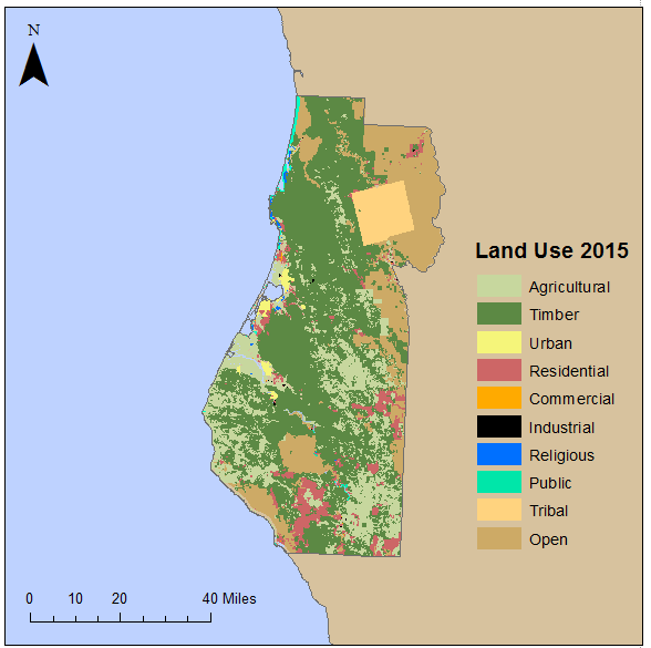
Now you can export your thematic map and add it to your report in the same way as we did for the locator map.
Adding Tables
You can add tables to MS-Word from the "Insert" tab. then, you can just type information into the table.
If you want to bring tables in from Excel you just want to avoid pasting them as "Objects". Instead, create the table in MS-Word and then copy and pate the contents of the table into MS-Word. This works best if you insert a table that has the same number of rows and columns as the spreadsheet. Then, copy the entire spreadsheet to the clipboard, select all the rows and columns in the table in MS-Word, and then paste the contents of the spreadsheet into the table. Then, you can use the "Design" tab to change the borders and background of the table.
Another approach that appears to work in Office 365 is to:
- Copy and paste the section of data from MS-Excel into MS-Word
- Right click in the “+” in the upper left of the table
- Select “Auto Fit -> Auto Fit to Window”
- Select a professional looking “Design” from the tab bar
Another difference is that the caption for a table is typically above the table and starts with "Table X." where X is the order of the tables in the document from 1.