Lab: Creating Flow Charts in MS-PowerPoint
Learning Outcomes
- Create flow charts to design GIS process flows
Presentations
This video will walk you through how to create flow charts in PowerPoint
Walk-Through: Creating Flow Charts in PowerPoint
As you begin working on more and more complex analysis tasks, you'll want to be able to diagram the steps you'll be using both for your own reference and to share with others. Microsoft PowerPoint is very easy to use to create flow charts.
1. Open PowerPoint.
2. From the "Home" tab, select "Layout" and then the "Blank" layout.
3. In the "Drawing" panel of the "Home" tab, you'll either see a drop down menu for "Shapes" or a palette of shapes with a drop down in the corner. Click on the drop down and you should see a large "palette" of shapes to select from.
 or
or 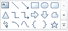
Tool bar options to access shapes
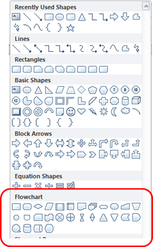
Shape Palette
There are a large number of flowchart shapes available but we'll only be using:
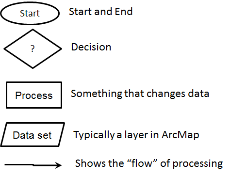
Basic Flow Chart Symbols
4. To get started, click on the oval shape and then press down and drag in the area of the slide.
5. Right-click in the shape and select "Edit Text".
6. You should see a blinking "caret" appear. Type the word "Start".
7. Now repeat with a rectangle for a "Process" block.
8. From the "Lines" section of the shape palette, select the "Elbow Arrow Connector". This is a special connector that will move with shapes once it is connected to them.
9. Move your mouse near the edge of a shape and you should see little boxes appear. Press your mouse in one of these boxes and then drag to the edge of another shape. You should see more little boxes appear on the other shape. Release the mouse button while in one of these boxes.
10. Now, drag the shapes around and you'll see that they are connected.
11. Continue with this until you have a flow chart with at least a "Start" shape, an "End" shape, a couple of process shapes, a couple of data set shapes, and lines connecting all of them.
12. Decision shapes are special shapes to determine the "direction" your processing will take. Let's say that you had a large number of raster files to process and you only wanted to process those that did not contain clouds over HSU. You might use the flow chart below.
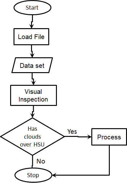
Note that the flow chart above has symbols for "Load File" and "Data set". These will not always be needed. The level of detail you provide in the flow charts is up to you but typically folks put in too little to start so if you're not sure whether to include a step, include it.
Model Builder
Model Builder in ArcMap uses different symbology than those presented above. Below is a flow chart created in PowerPoint using the symbols that are similar to the ones in Model Builder. You can use this as a started point for your flow chats instead.
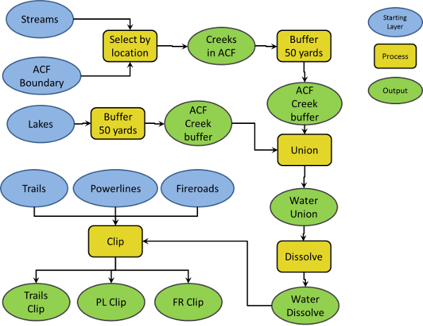
These are the "standard" symbols but there are a lot of variations on the standard. Any symbology that works and has a legend is appropriate.