In this lab, we will explore the spectral signatures of various features using the Spectral Profile tool in ENVI. We will collect and compare spectral signatures of several different materials in a Landsat image.
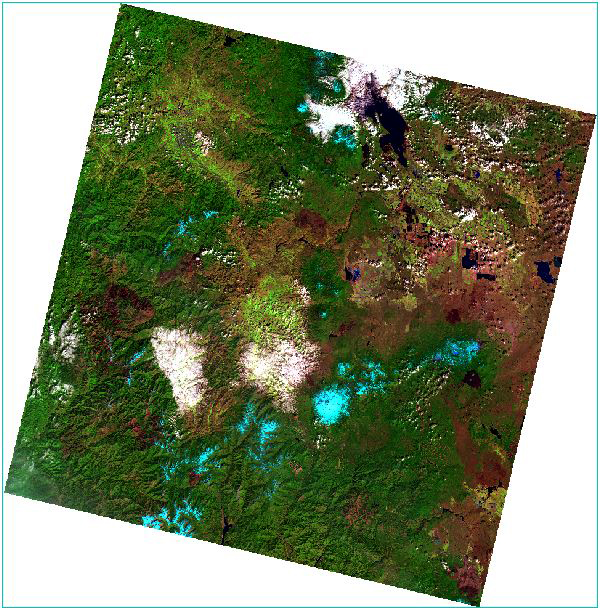
We will view the Landsat scene in true color (also called natural color) and in various false-color composites. The first false color composite we will be using displays the near-infrared band (Band 5) in red, the red band (Band 4) in green and the green band (Band 3) in blue. This classic false-color composite allows vegetation to be readily detected in the image, as it appears in different shades of red depending on its type and health. Other false color composites show different portions of the spectrum. For example, the image on the left, the shortwave infrared (Band 6) is displayed in red, the near-infrared band (Band 5) in green, and the red band (Band 4) is displayed in blue. In this composite, vegetation appears a vibrant green, bare ground appears reddish, and snow appears bright blue. False-color composites allow us to visualize and map invisible spectral bands to visible colors (Red, Green, Blue). False-color composites aid in feature detection, such as identifying vegetation types, geological features, and surface features that are indistinguishable in true color.
Learning Outcomes
Become more familiar with ENVI functions, including opening up multiple views, linking views and changing RBG combinations.
Understand the differences in true color and false color composites and compare different types of false color composites.
Learn how to collect, view and export Spectral Profiles in ENVI.
Describe spectral reflectance curves for common materials
Import data into spreadsheets and create professional graphs and tables
Format and write scientific style reports that include figures and tables.
About the Data
Landsat 8/9
Band #
Band Name
Wavelength
(micrometers)
Band 1
Coastal aerosol
0.43 - 0.45
Band 2
Blue
0.45 - 0.51
Band 3
Green
0.53 - 0.59
Band 4
Red
0.64 - 0.67
Band 5
Near Infrared (NIR)
0.85 - 0.88
Band 6
Shortwave Infrared (SWIR1)
1.57 - 1.65
Band 7
Shortwave Infrared (SWIR2)
2.11 - 2.29
The Landsat 8 and 9 satellites detect and measure energy in different ranges of wavelengths along the electromagnetic spectrum. Each of these ranges of wavelengths in known as a band and both Landsat 8 and Landsat 9 each captured data in 11 bands. The first seven of these bands are in the visible and infrared part of the spectrum and are commonly known as the "reflective bands" and are captured by the Operational Land Imager (OLI) on board Landsat 8/9. In addition to the seven bands listed in the table to the right, the OLI sensors also has captures a panchromatic or black-and-white band (Band 8) and a cirrus cloud band (Band 9) that is used to detect cirrus clouds.
In addition to the OLI sensors, Landsat 8/9 also have a Thermal Infrared Sensor (TIRS) which collects data in two thermal infrared bands. Read more about Landsat Bands
The specific data used in the lab is a Landsat 9 image of the northern Idaho acquired May 29th 2025. This data has been calibrated corrected for atmospheric scattering so that the values represent surface reflectance. That means that a pixel value of 0.5 represents 50% reflectance and 1 would equate to 100% reflectance.
Setting up your Workspace
First we need to set up our workspace, transfer the data and open the Landsat image in ENVI.
Create a folder on the desktop by following the below steps:
Right click the Desktop, Click on New → Folder
Name the folder “Lab_03”. Your folder should be located C:\Users\abc123\Desktop (abc123 will be your HSU user name)
Within the Lab 3 folder, create two sub folders named:
Originals
Final
Navigate to the Lab 3 folder on either the shared class Google Drive folder or from the Class share Z: Drive, download the file “Lab3Data”. Move the ZIP file to your Lab 3 Originals folder on your desktop or extract the ZIP file directly into your Originals folder.
Right click on the ZIP file and select “Extract All”. Now the files have been uncompressed and are ready to view.
Start “ENVI (6.2)” and open the raster file “Landsat05292025.dat” which should be located in your Lab_03 Originals folder. You should now see the true color Landsat image centered around northern Idaho in your main viewer.
Reference Map, Navigations, Views and Data Manager
In ENVI by default the image window displays data layers in a single view. You can add up to 16 views containing different files. You can also link multiple image window views by geography so when you zoom or pan in one view the other views automatically follow. There is also the Overview option that shows a thumbnail of the raster and defines the extent currently shown in the view. Another useful tool is the Reference Map Link that opens up a new window with a base map that shows the geographic extent of the raster in the viewer. The Go To
Now use the Reference Map link tool to orient yourself to the geographic area and terrain that this image covers. From the menu bar select View → Reference Map Link. This opens up a new window with a base map that shows the geographic extent of the raster in the viewer. Click the Switch Basemap drop-down list and select a different type of base map (image, topographic, streets, etc.). After you’re done exploring, you can close the basemap window.
Another tool to help with navigation to specific locations is the "Go To" tool in the main toolbar. The tool allows your to "jump" to a specific location (based on geographic coordinates) in an image and centers the current image window view over that location. Enter the coordinates in the Go To field, using one of the acceptable entry formats and press enter. You can also copy and paste coordinates in to the "Go To" field. Use the Go To tools to check out some of the below coordinates. You may want to zoom into 100% before entering in coordinates in the Go To tool.
Locations to Check Out:
Cougar Creek Fire Burn Scar - 46.0854530°N,117.3989638°W
Agricultural Fields near Lewiston, ID - 46.3871711°N,116.8584964°W
Dworshak Dam and Reservoir -
46.5161477°N,116.2928532°W
Now that we have an idea of the geographic extent of our image, we will open a second view and display the image as a false color composite. Select Views → Create New View to open a new view in the image window.
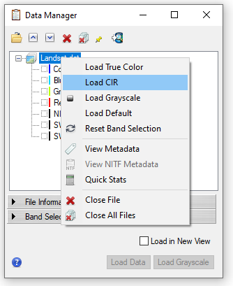
Click on the new view (either in the Layer Manager in the the view), it will show a light blue outline when selected as the active view. Open the file “Landsat05292025.dat” again, but this time when you open the file you will see the Data Manager menu open instead of the. Right click on the Landsat file and select "Load CIR". This will load a NIR false color composite of the Landsat image in the new view.
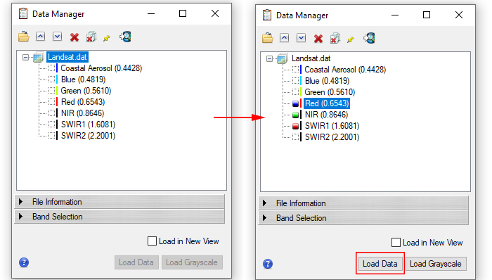
The Data Manager allows you to see all data that has been opened in ENVI. For rasters, the Data Manager lists all available bands of a rasters and allows you to select the desired RGB band combination. By default, if you have already opened an image in ENVI the Data Manager will pop-up. To display the data in the viewer, you must either manually select the bands or right click to select default options (if available). To assign an RGB combination, click the band name you want to assign to red, then repeat to assign the green and blue selections. Click the Load Data button.
Linking Views and False Color Composites
In the Color Infrared composite, NIR reflectance is show in red on the screen, Red reflectance in green and Green reflectance in blue. Now we will link our two views together so the two view display the same area. From the main menu, select Views → Link Views. The Link Views dialog opens, showing thumbnails of each view.
In the Link Views window, select the “Geo Link” option and then click the “Link All” button. This links all open views. Click “OK”. Now when you zoom or pan in one view the other views automatically follow. This can be very helpful when looking at multiple data sets in a common geographic area. Using the Link View tool, you can link up to 16 views by geographic location so that all linked views will go to the same location at the same time when you pan/zoom around the image.
Now the two views are linked, when you move or zoom into one Landsat image, the view with the other image will follow. Explore some of the image and the associated colors in the true and color infrared composite.
Now we will add a third view, Views → Create New View. Make sure you have the new view selected by either clicking in the empty viewer or by clicking on the view in the Layer Manager. Click on the Data Manager icon and you will see the Data Manager menu.
In the Data Manager you will select what bands will be displayed in the three primary colors on the screen, in the order of Red, Green, Blue. Click the box on next to “SWIR1 (1.6081)”, it will turn red after it has been selected. Next click the box next to “NIR (0.8646)” and it should turn green and lastly click the box next to “Red (0.6543)”, then click the Load Data button.
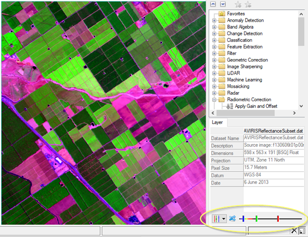
This will display the same Landsat image as a false color composite, with shortwave infrared displayed in red, NIR displayed in green and Red displayed in blue. This is a common band combination that is useful for seeing changes in plant health and for discriminating between land cover types. Now link the new view with the other two views by repeating steps 9-10. Compare the three Landsat images. Make note of some of the colors in the false color composite for the different land cover types. This false color composite displays the Shortwave infrared 1(Band 6) in red, near-infrared band (Band 5) in green, the red band (Band 4) is displayed in blue. In this composite vegetation looks green, bare ground appears reddish and snow appears bright blue.
You can also change the band combinations without loading new data by using the Dynamic Band Selection tool, which allows you easily change the RGB band combination for the selected raster in the view. The Dynamic Band Selection controls appear at the bottom of the Layer tab when a raster file is open.
Navigate to the Layer tab in the lower right hand corner. This is where the band selection tool is located. Start by selecting different preset band combinations from the list, to do this, click the drop-down arrow next to the sliders . Try a few different preset composites.
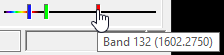
Now try selecting your own band combinations. To make your own band combinations, click and drag the slider bars for red, blue, and green to select the bands to use for each display color.
Before moving on to the next step, take a screenshot or "Chip" both the natural color and at least one of the false color Landsat images. Click the click the "Zoom to full Extent" and take a screenshot or use the Chip to View and save the selected view as a JPG. Save your images in the Final folder, you will need these for your report. You may include figures with multiple false color composites if you like.
Collecting Spectral Profiles
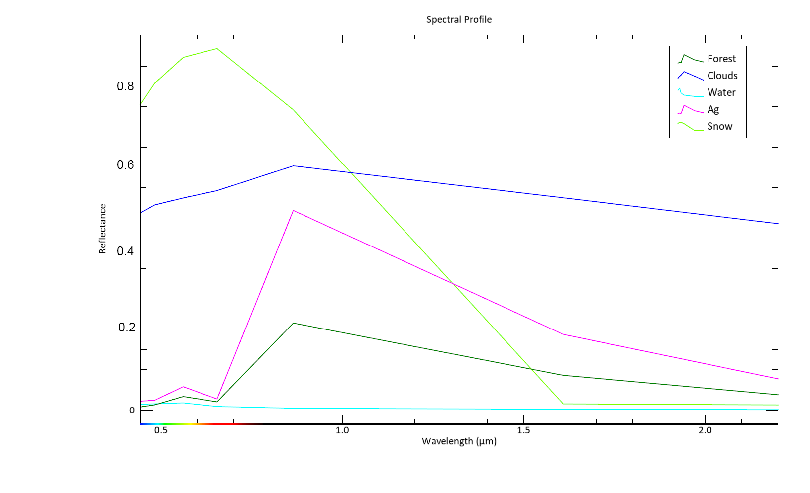
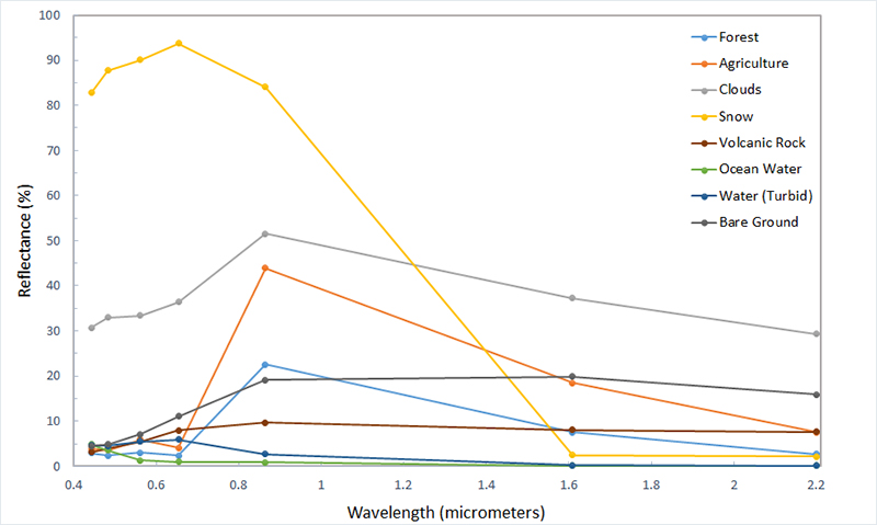
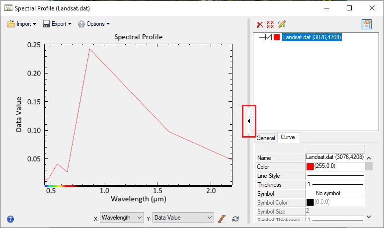
The Spectral Profile plots the spectral profile or spectral reflectance curve (of all bands) for the selected pixel. Wavelength in micrometers is displayed on the x-axis and the data value of the pixel on the y-axis. In this case the data value represents the percent reflectance from 0 to 100% for the pixel in each band (wavelength). The Landsat surface reflectance data viewed in this lab is represent by decimals. This means that a value of 1 indicates 100% reflectance at that particular wavelength and value of 0.5 would represent 50% reflectance.
Note: Occasionally there are reflectance values that are recorded as greater than 100%, one example is on the sun-lit sides of steep snow-covered mountain.
Select a false color for the Landsat image that makes it easy to see the different land cover types, select one of the following presents: Vegetation, Shortwave Infrared or Agricultural. Click the Spectral Profile icon on the toolbar or select Display → Profiles → Spectral from the menu bar. This opens the Spectral Profile window, by default it plots the spectral profile of the pixel in the center of the screen.
Click and drag the cursor in the image window to see the spectral profile of that pixel. Notice how the profile changes as you click on different areas (clouds, water,snow, etc.). Spend sometime exploring the tool and spectral reflectance profiles of different land cover. You can use a combination of the Landsat images and the Reference Map Link with Satellite Imagery to use as a guide for selecting different features.
Let's collect our first spectral profile by starting with a pixel of clear water. A recommended location is the middle of Wallowa Lake (45.327856, -117.212748). Navigate to your clear water sample location. We will add a new spectral profile.
To add a new profile, press (and hold) the Shift key at the same time as you click a new pixel in the image window. This will create a second profile. You should now have two spectral profiles.
We will be collecting multiple profiles so we need to label each profile collected. Click the arrow on the right of the Spectral Profile window to show additional properties. The "General" tab allows you to change the font size, x and y-axis labels
and other chart settings. The "Curve" tab allows you change the specific properties of each profile collected. Click the "Curve" tab, this displays the properties associated with each profile collected
Click in the "Name" field and erase the current name and type "Clear Water" and press enter. In this tab you can also change the color, line style data markers and more. Don't spend too much time formatting, as we will be exporting the data as a text file and will use Excel to create graphs and tables based on the data.
Now we will collect more spectral profiles for other land features. To add a new profile, press (and hold) the Shift key at the same time as you click a new pixel in the Image window. Then use the Select tool to move the cursor around to select a pixel of the next land cover type (see below). If you click with out holding down the shift key you will lose your original curve. You can use the Pan tool to move around the image without selecting data, but you will need to switch back to the select tool to select the pixel. If you accidentally create profile(s), you can delete the profile by right clicking on the profile and selecting Remove Selected Curve. You can also right click on the a profile to "Go to" to sample pixel on the Landsat image. This is useful if you want to double check your sample location or re-label a profile.Spend some time getting used to using the spectral profile tool. Once you are comfortable with sampling points and labeling the curves, repeat the above steps for each of the below land cover types, making sure to update the name of each of the profiles after you collect the sample. You should have a total of 8 spectral profiles:
Use the false color imagery, the reference map (Views> Reference Map Link) and the locations and coordinates provided in Step 6 to help locate the different land cover types.
Clear Water(done in previous step)
Turbid/Algae (Cloudy) Water (Dworshak Reservoir is an option)
Clouds
Forest
Agriculture or Golf Course
Rock
Burned Area
Snow
When you have collected all of your profiles, right click on each of the profiles in the list and select "Go to". This will show you the sample pixel on the Landsat image associated with this spectral curve. Double check your spectral profiles and samples, re-label or re-take any profiles if necessary.
Formatting and Exporting Spectral Profile Plot & Data
Enlarge or Maximize the spectral profile window so it's easier to view. Now we will add a legend to our plot. Select "Options" → "Legend" from the Spectral Profile menu bar. The legend should now appear in the profile plot. Review your legend and graph to make sure you have collected all of the necessary data and have properly labeled your curves. Note that your graph should have 8 profiles and the shape of the curves may differ from the example below.
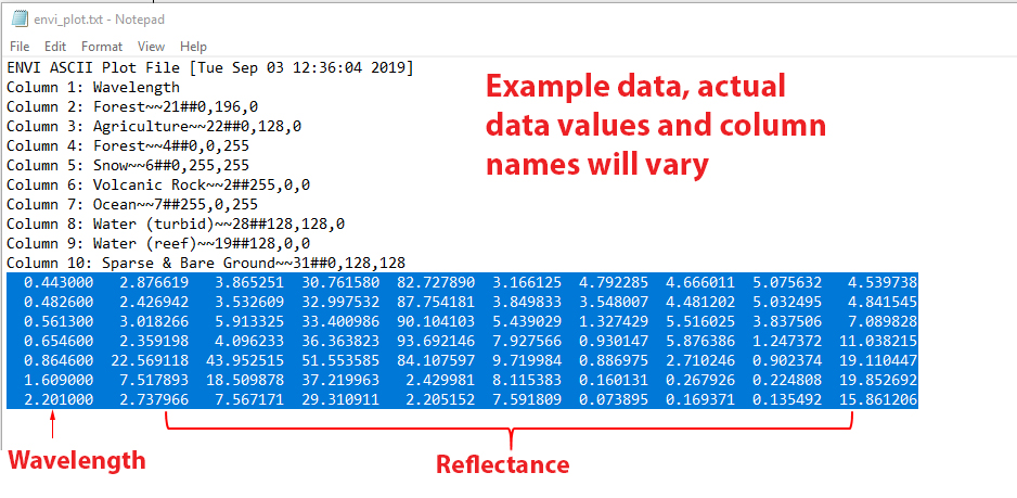
Now it's time to export the plot data so we can make a more appealing graph in Excel. Select "Export" → "ASCII" from the Spectral Profile menu bar. This will export the plot data as a text file. Save the text file file in your Lab 3 Final folder. Navigate to your folder on the desktop and find your text file and double click on it. It should open in Notepad by default, leave it open.
For reference you can export your spectral profile plot as an image. Select "Export" → "Image" from the Spectral Profile menu bar. The default filename and format is envi_plot.png, you may want to rename it. Save the image in your Lab 3 Final folder. You may now close ENVI, make sure the profile data has been saved before closing the window, if not your work will be lost and you will have to start over!
Importing Data and Creating Graphs in Excel
Open up Microsoft Excel and open a new blank workbook. Switch back to text file that is open in Notepad and copy the data as shown below. The first column is the wavelength (x axis) and the following columns are the reflectance for the different materials at each of the wavelengths.
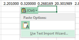
Paste the data into Excel. After pasting, a small clipboard icon will appear below your data. Click on it and select "Use Text Import Wizard".
In the Import Text File window Step 1, set the Original data type to "Delimited" and click "Next".
On Step 2, under "Delimiters" check and "Space" then click next. This will tell Excel that the data is separated by spaces, in the Data Preview you should see the data appear in separate columns. On step 3 simply click "Finish".
Insert a row above your data by right click on Row 1 and selecting "Insert". Add column headings based on the text file. The first column is the wavelength and the remaining columns should be labeled as the corresponding land cover type (Water, clouds etc).
Since the Y values represent percent reflectance, we will format the values as percent. Select all of the reflectance values. In Excel on the Home tab, find the Number group. Click the Percent Style (%) button. Reduce the number of decimals to one or two decimal places.
To change the number of decimal places shown, use the Increase Decimal or Decrease Decimal buttons.
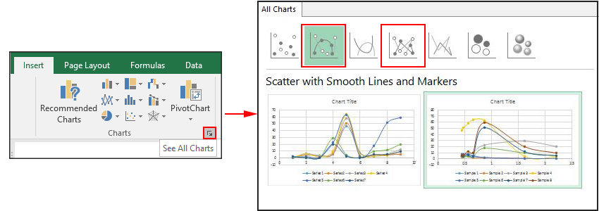
Now we will create a graph from the data. Highlight all of the data (including header) and navigate to the Insert tab and click the small "Recommended Charts" arrow in the lower corner. Click All Charts → XY (Scatter) and select either the chart type "Scatter with Smooth Lines and Markers" or "Scatter with Straight Lines and Markers". Select the chart option where wavelength is shown on the x-axis (from 0-2.5 micrometer) and reflectance on the y-axis (from ~0-100%), then select OK. The chart will appear in the spreadsheet.
Check to make sure that wavelength is displayed on the X-axis (Horizontal) and reflectance % on the Y-axis. If your data is not properly plotted use the "Switch Row/Column" function in Excel charts to toggle the data plotted on the X-axis (categories) with the data shown in the legend (series). To switch rows and columns in an Excel chart, select the chart, navigate to the Chart Design tab, and click Switch Row/Column button in the Data group. This instantly toggles the data plotted on the horizontal axis (categories) with the data in the legend.
Click the Add Chart Element icon in the top left hand corner and select "Axis Title" → Primary Horizontal. Repeat and select "Axis Title"→ Primary Vertical. You should now see labels on the axes. Update the axis labels, the Y-axis should read "Reflectance" and the X-Axis "Wavelength (micrometers)". Remove the title by clicking on it and hitting delete.
Right click on the Y-axis and select "Format Axis". Change the bounds so that the minimum value is 0 and the maximum is 1 (100% reflectance). Repeat this process for the X-axis, changing the minimum to 0.4 and maximum to 2.3.
Resize the chart (it should be at least 5-6 inches wide). Increase the font size of the axis labels and legend labels (recommend at least 12 point). You may want to change the location and format of the legend by right clicking on it and selecting "Format Legend".
If you would like to change the colors of the data lines, right click on the line you want to change and select "Format Data Series", this allows you to change the color and style of the lines.
You can also use the Design tab to select different preset chart styles.
Save your Excel spreadsheet in your Lab 3 Final folder. The easiest way to insert your graph into your final report is to simply copy and paste your graph into your document. You may want to open a Word document now and paste your graph into the document.
Create a professional looking data table with the reflectance data value for your final report. I recommend pasting the data table into Word and using the Table Design and Layout tools to change the style and formatting of your table. There are many default table styles that work well. Keep the formatting simple and easy to read. Save your Word document in your Lab 3 Final Folder.
Make sure to properly label your figures and tables with an appropriate captions. Before leaving ensure you have backed-up your screenshots, spreadsheet and other data onto your Google Drive or the ClassShare Z: Drive. The easiest way to-do this is to just transfer your Lab 3 Finals folder, there is no need to back up your original data.
Lab Report (Upload to Canvas)
For this assignment you will be submitting a written report presenting and discussing the results of the spectral profiles. This assignment will focus on the results and discussion sections of a scientific report. Here are some resources
Your report should include the following elements:
Your Name and the date and Title: The title should be more that just Lab 3. It should describe the report. For example "Spectral Profiles from Landsat Imagery"
Results: The results section should simply present the findings of the analysis or investigation. The text section should present the key data, relationships and observations from the study. Detailed data should be presented in tables and figures to support the text. Interpretation of the results belongs in the discussion.
Include the following information in the results section of you report:
Describe the results of the spectral profiles. Discuss the general shape of each of the curves, note which materials had the highest and lowest reflectance and in which parts of the spectrum.
The Spectral Profile chart and table should be included and referenced in the results section.
Discussion:The discussion section is where you provide an interpretation and discussion of the results. This includes providing scientific reasoning and explanation for the observed results and discussing the greater implication of the research/findings.
Your discussion should be detailed, you should have at least a paragraph for each of the below discussion points. In your discussion answer the following questions:
For each of the land cover types sampled, provide a scientific explanation for the spectral profile observed.
Discuss the colors of the various land features (vegetation, bare ground etc.) in the second IR false color composite (SWIR, NIR, Red) and how these colors relate to the spectral profiles you observed. You may want to reference and/or include the figure(s) showing the Landsat image in this section.
Discuss the importance and possible applications of spectral reflectance curves in geospatial analysis.
Figures & Tables: Figures should always be cropped and labeled with the figure number and with appropriate captions. Tables should include appropriate data labels and captions. Any Table or Figure you present must be sufficiently clear, well-labeled, and described by its legend to be understood by your intended audience without significant reading of the results, i.e., should be easily interpretable. Figures and Chart Reference - UNC
Include the below tables and figures in your report. They can either be included in the body of the report or included at the end of the report.
Figure: The Spectral Profile chart you created in Excel with an appropriate label and caption.
Figure: Landsat images (true color and false color). These can be one figure (side-by-side images) or two separate figures.
Table: Data table showing the reflectance values for the different land cover type with an appropriate label and caption.
Contact Info
Cal Poly Humboldt
1 Harpst Street Arcata, CA 95521
skh28@humboldt.edu
 to move around the image without selecting data, but you will need to switch back to the select tool to select the pixel. If you accidentally create profile(s), you can delete the profile by right clicking on the profile and selecting Remove Selected Curve. You can also right click on the a profile to "Go to" to sample pixel on the Landsat image. This is useful if you want to double check your sample location or re-label a profile.
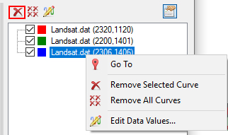 Spend some time getting used to using the spectral profile tool. Once you are comfortable with sampling points and labeling the curves, repeat the above steps for each of the below land cover types, making sure to update the name of each of the profiles after you collect the sample. You should have a total of 8 spectral profiles: