 R for Spatial Statistics
 Generalized Linear Models
Generalized Linear Models (GLMs) can create four different types of models each with a different expected distribution for the residuals. These include:
| family | Model | Error distribution | Examples |
| gaussian | identity | Gaussian | linear |
| poisson | log | Poisson | counts |
| binomial | logit | Binomial | presence/absence |
| gamma | inverse? | Gamma | distances |
The "family" is used to specify the model in R. The "Model" represents the trend within the data. The "Error Distribution" is the expected distribution of the residuals.
To complete the steps below, you'll need to include the glm2 library.
Fitting the Model
The code below will fit a model to a dataset using a GLM and the binomial distribution for the residuals. This is the most commonly used option for GLMs and expects the measured values to follow a logistic. This is typically used for binary data such as presence/absence, burned/unburned, etc.
library(glm2)

TheModel=glm2(Measures~Xs,data=TheData,family=binomial) # logit (binary)
summary(TheModel)
The output is similar to a linear model with the exception of a few new items.
Call:
glm2(formula = Measures ~ Xs, family = binomial)

Deviance Residuals:
     Min        1Q    Median        3Q       Max
-2.19011  -0.18968   0.02669   0.18966   2.25542

Coefficients:
            Estimate Std. Error z value Pr(>|z|)
(Intercept) -7.86152    1.78795  -4.397 1.10e-05 ***
Xs           0.15882    0.03521   4.511 6.45e-06 ***
---
Signif. codes:  0 ‘***’ 0.001 ‘**’ 0.01 ‘*’ 0.05 ‘.’ 0.1 ‘ ’ 1

(Dispersion parameter for binomial family taken to be 1)

    Null deviance: 138.589  on 99  degrees of freedom
Residual deviance:  41.339  on 98  degrees of freedom
AIC: 45.339

Number of Fisher Scoring iterations: 7
Note that at the bottom is the AIC. This and the model itself, are the two key pieces of information for model selection. The "Null deviance" is effectively the "-2ln(L)" portion of the AIC for a "Null" model and the "Residual deviance" is the same calculation for the fitted model (i.e. the residual deviance should be less than the Null deviance. The "Fisher Scoring" is the method used to find the maximum likelihood and is not critical for model selection.
The standard error of the ceofficient represents how well the coeficient has been estimated (http://tinyurl.com/j5ccvgo). The z value is the regression coeficient divided by the standard error. If the z-value is large (>2), then the coeficient matters (http://tinyurl.com/hxexbtg). The Pr(>|z|) is like a p-value.
Note that the plots provided are described below, however, these plots are intended for linear models and can be misleading for GLMs.
plot(TheModel)
We can obtain the residuals and histogram them as below. Does it make sense to use these functions to evaluate the residuals of a GLM?
residuals(TheModel)
hist(residuals(TheModel))
We can view the fitted values and plot them with:
fitted(TheModel)
plot(fitted(TheModel))
Prediction
Note that there are two functions that will create a prediction for a GLM, "predict()" and "fitted()". Sources on the web indicate that predict() does not include the "link" function so it should not be compared with the original data. However, in my experience, predict() does overlay the original data properly so it must be applying the link function and fitted() will only predict against the original model values. If you want to predict against a new set of predictors (to make a map, for instance), you'll need to use predict. Note that the "type="response"" parameter is also required.
Xs=as.vector(array(1:100)) # create a vector with the full range of x values
NewData=data.frame(Xs) # put this into a dataframe for prediction (names must match the model)

ThePrediction=predict(TheModel,newdata=NewData,type="response") # create the prediction
Note that GLM is much pickier about it's inputs than most R functions. You may receive errors for having too few points or too many. Also, if it cannot find a reasonable result, it can also provide errors.
Plots
Start by plotting your prediction against the original data and you should have something like the following:
plot(TheData$Xs,TheData$Measures) # plot the original points
points(Xs,ThePrediction,col=2,pch="+") # plot the prediction
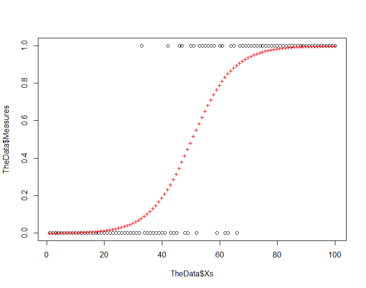
Note that the residuals increase as we move from the response values of 0 and 1 toward 0.5. This is inherent in a model where we are using a logistic equation to model a binary phenomenon.
Now, run the model plots again to produce four graphs that can be used to interpret the model:
plot(TheModel)
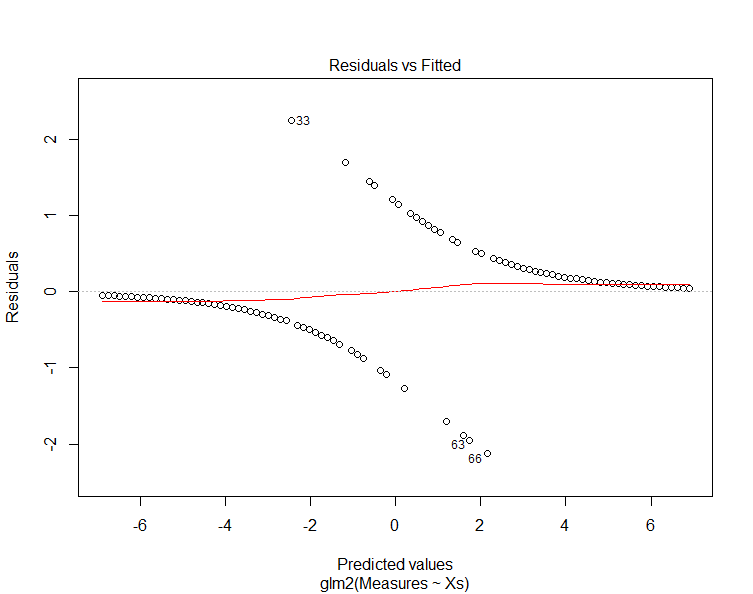
The "residuals vs. fitted" plot shows the residuals on the y-axis and the fitted values (y values from the samples) on the x-axis. Another way to think of this is that the x-axis shows the predicted value along the trend line and the y-axis shows the difference between this value and the sample value (i.e. the residual).
Note that the residuals diverge from the prediction. Examining the previous chart explains why this is happening and why this is not a good chart to use to evaluate GLMs.
Other "Link" Functions
Below are some of the other link functions provided by the glm2() function. Try them with your data and evaluate the AIC values against the response curves provided.
TheModel=glm2(Measures~Xs,data=TheData,family=gaussian) # identity (eg. linear)
TheModel=glm2(Measures~Xs,data=TheData,family=poisson) # log (eg. counts)
TheModel=glm2(Measures~Xs,data=TheData,family=binomial) # logit (eg. binary)
TheModel=glm2(Measures~Xs,data=TheData,family=Gamma) # inverse (eg. distances)
Note that the AIC values are not comparable across the methods for GLM. They are only valid for comparison within one method and with the same data set. We'll chat more on this later.
Example Using Full Study Area
The example below takes a dataset that contains a grid of points for the entire study area as described in Creating Predictive Maps for Continous Variables and Points/CSV files and creates a GLM based on one covariate. To increase the number of covariates, just add their values in BlueSpray and update the model.
library(glm2)

############################################################################
# Creates a data frame with Xs ranging from 1 to the number of entries
# and "Measures" with 1/2 set to 0 and 1/2 set to 1.  The lower have of
# the X values have measures at 0.
# ProportionRandom - amount of uniform randomness to add
############################################################################
TheData = read.csv("C:\\Users\\jg2345\\Desktop\\GSP 570\\Lab4 GLM\\Points from Raster2.csv")

# Remove any NA (null) values
TheData=na.omit(TheData)

# Convert an attribute (vector column) to numeric
BooleanValues=TheData$Count>0
Present=as.numeric(BooleanValues)
TheData=data.frame(TheData,Present) # add the numeric (0s and 1s) into the dataframe
TheData=na.omit(TheData) # make sure we remove any non-numberic values that might have been produced

# Plot the data
TheData$Percip=as.numeric(TheData$Value)
plot(TheData$Percip,TheData$Present) # plot the data

# Create the GLM
TheModel=glm2(Present~Percip,data=TheData,family=binomial) # logit (binary)
summary(TheModel)

# Predict values based on the model
ThePrediction=predict(TheModel,newdata=TheData,type="response") # create the prediction

# Plot the data and the predicted values
plot(TheData$Percip,TheData$Present) # plot the data
points(TheData$Percip,ThePrediction,col=2,pch="+") # plot the prediction

# add the prediction to the existing dataframe
FinalData=data.frame(TheData,ThePrediction)
plot(FinalData$Percip,FinalData$ThePrediction)

# Save the prediction to a new file
write.csv(FinalData, "C:/Temp/ModelOutput.csv")
Example
The files below represent examples of creating models for the presence of Doug-Fir trees in California. The Doug-Fir data set can be converted to "Points with Binary Values" as explained in the Converting Data Types web page and then adding predictor layers values from rasters for the study area. The code below is an example to create a predicted output for Doug-Fir based on the new presence-absence value. Note that these are examples and are not going to work exactly as you may desire. Also, you'll need to modify these examples for your own covariates or your own response data.
#########################################################
# Read and clean up the data
library(glm2)

# read the data into an R dataframe
TheData <- read.csv("C:/Temp/DougFir_CA2.csv")

# Remove any NA (null) values, the data should already be loaded
TheData=na.omit(TheData)

# plot the covariate against the response
plot(TheData$AnnualPrecip,TheData$PresAbs)

# create the model
TheModel=glm2(PresAbs~AnnualPrecip,data=TheData,family=binomial) # logit (binary)
summary(TheModel)

# create the prediction fector
ThePrediction=predict(TheModel,newdata=TheData,type="response") # create the prediction

# plot the original points and the predicted points
plot(TheData$AnnualPrecip,TheData$PresAbs) # plot the original points
points(AnnualPrecip,ThePrediction,col=2,pch="+") # plot the prediction

# predict based on the original model values (i.e. the entire data set)
ThePrediction=predict(TheModel,type="response") # create the prediction

# add the prediction to the existing dataframe
FinalData=data.frame(TheData,ThePrediction)
plot(FinalData$AnnualPrecip,FinalData$ThePrediction)

# Save the prediction to a new file
write.csv(FinalData, "C:/Temp/ModelOutput.csv")
Additional Resources
cv.glm, Cross-validation for Generalized Linear Models (uses k-fold)