 R for Spatial Statistics
 R Variograms & Kriging
R provides functions to create variograms and create surfaces (rasters) using Kriging.
These examples use the following data sets:
- Random: Random values
- Gradient: Values form a gradient from west to east (left to right)
- Sine: Values are based on a sine wave along a diagonal from the southwest to the northeast (lower left to the upper right)
These were created in Excel by the following steps:
- Create an "x" and "y" column and will them with random values between 1 and 1000. These will simulate coordinates.
- Create an "m_grad" column to simulate a gradient and set it equal to the same as the "x" column
- Create an "m_rand" column and make it a random variable
- Create an "m_grad_rand" column and make it equal to the random column values plus the gradient column values
- Create an "m_sine" column and set it to the sine of the x column times the y column after scaling the columns to go from 0 to 2 PI or:
- m_sine=sine((x/1000*2*PI)*(y/1000)*2*PI))
- Excel code: =SIN(A2/1000*2*PI()+B2/1000*2*PI())
- Export the file as a "CSV"
Remember to load the "gstat" and "sp" libraries before continuing.
install.packages("gstat")
library(gstat)
install.packages("sp")
library(sp)
Random Data
Read the data into RStudio and plot "x" against "y".
TheData=read.csv("C:/ProjectsR/GSp470/autocor_data.csv")
plot(TheData$x,TheData$y)
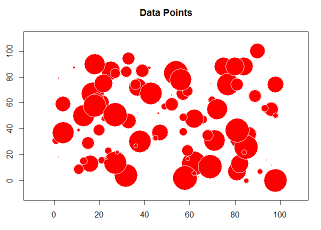
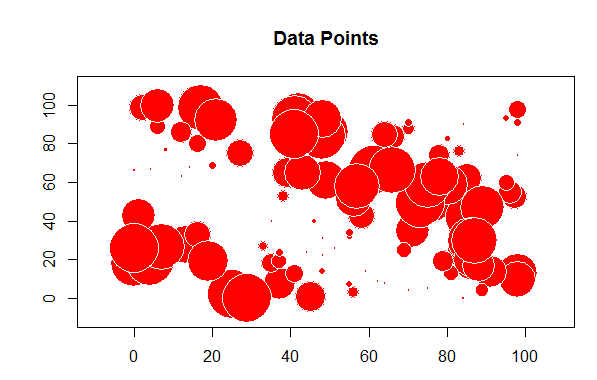
The problem with this is we want to see the values and where they are located. For this we will start using the "sp" library to first convert the "x" and "y" columns to coordinates and then create a bubble chart to plot the random values.
# load the sp library
library(sp)


# remove any null data rows
TheData=na.omit(TheData)


# convert simple data frame into a spatial data frame object
coordinates(TheData)= ~ x+y


# create a bubble plot with the random values
bubble(TheData, zcol='m_rand', fill=TRUE, do.sqrt=FALSE, maxsize=3)
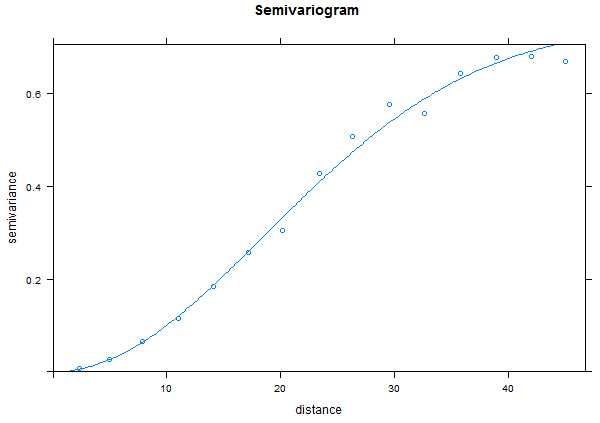
Next, we are going to create a simple variogram. This "bins" the data together by breaking up the distances between each of the points based on a "lag" size between the distances. Run the following code and view the result.
TheVariogram=variogram(m_rand~1, data=TheData)
plot(TheVariogram)
Enter the name of the variogram in R and you'll see a table with the following values:
- np - number of points in the lag (bin)
- dist - average distance between points in the lag
- gamma - mean for the lag
Next, we want to fit a variogram model to the binned data and add it to our graph. For this, you'll need to select the sill ("psill"), nugget, and range values appropriately or the curve may not appear on the graph. For now, we are just picking values and then we will fit the variogram to the data.
The "model" can be one of the following:
- "Exp" (for exponential)
- "Sph" (for spherical)
- "Gau" (for Gaussian)
- "Mat" (for Matern)
TheVariogramModel <- vgm(psill=0.15, model="Gau", nugget=0.0001, range=5)
If you print the "TheVariogramModel" variable, you'll see the new values for the nugget and sill.
plot(TheVariogram, model=TheVariogramModel)
Next we "fit" out variogram model to the variogram.
FittedModel <- fit.variogram(TheVariogram, model=TheVariogramModel)
plot(TheVariogram, model=FittedModel)
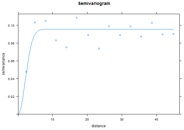
Note that for random data there is very little auto correlation so the range is very small and we reach the sill quickly.
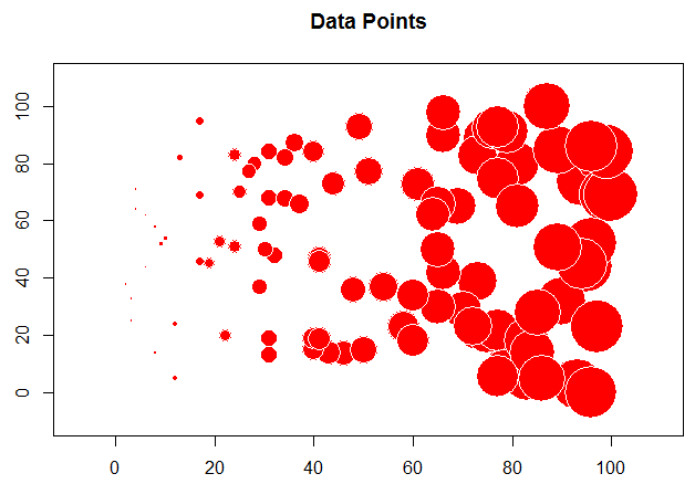
Gradient
For this example, use the gradient data and see how different the plots are.
In the example above, we needed to determine the values for the variogram (nugget, range, and sill) ourselves. We can also "fit" an existing model to a variogram from our data.
TheVariogram=variogram(m_grad~1, data=TheData)
plot(TheVariogram)
TheVariogramModel <- vgm(psill=50000, model="Gau", nugget=0.001, range=500)
FittedModel <- fit.variogram(TheVariogram, model=TheVariogramModel)
plot(TheVariogram, model=FittedModel)
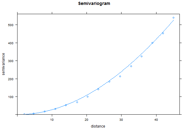
Notice for the gradient data, we have a very long range and really never reach a sill.
You can examine the fitted values for the variogram with the "summary()" function. The sill is the "Mean" value of the "psill" values while the nugget is the "Min" of the "psill". The range is in the "Mean" value for the "range".
     model       psill              range            kappa            ang1        ang2
 Nug    :1   Min.   :    81.6   Min.   :   0.0   Min.   :0.000   Min.   :0   Min.   :0
 Gau    :1   1st Qu.:146756.2   1st Qu.: 374.8   1st Qu.:0.125   1st Qu.:0   1st Qu.:0
 Exp    :0   Median :293430.9   Median : 749.7   Median :0.250   Median :0   Median :0
 Sph    :0   Mean   :293430.9   Mean   : 749.7   Mean   :0.250   Mean   :0   Mean   :0
 Exc    :0   3rd Qu.:440105.5   3rd Qu.:1124.5   3rd Qu.:0.375   3rd Qu.:0   3rd Qu.:0
 Mat    :0   Max.   :586780.2   Max.   :1499.3   Max.   :0.500   Max.   :0   Max.   :0
 (Other):0
      ang3       anis1       anis2
 Min.   :0   Min.   :1   Min.   :1
 1st Qu.:0   1st Qu.:1   1st Qu.:1
 Median :0   Median :1   Median :1
 Mean   :0   Mean   :1   Mean   :1
 3rd Qu.:0   3rd Qu.:1   3rd Qu.:1
 Max.   :0   Max.   :1   Max.   :1
Note: The values for the psill and range look appropriate to me (use the means). I'm not sure where the nugget is (it should be about 0) and there is minimal documentation on the output for R functions - a great extra credit opportunity!
Sine Function
Now try the "sine" data which clearly has some autocorrelation.
This shows that there is autocorrelation in the "sine" data but the graph also shows a strong trend in the autocorrelation from the north-west to the south-east. This is referred to as "anisotropic" (not the same in all directions).
Anisotropy
We can check for anisotropy with a directional "map"
# Create a "gstat" object
TheGStat <- gstat(id="Sine", formula=m_sin ~ 1, data=TheData)
TheVariogram=variogram(TheGStat, map=TRUE, cutoff=4000, width=200)
## the original data had a large north-south trend, check with a variogram map
plot(TheVariogram, threshold=10)
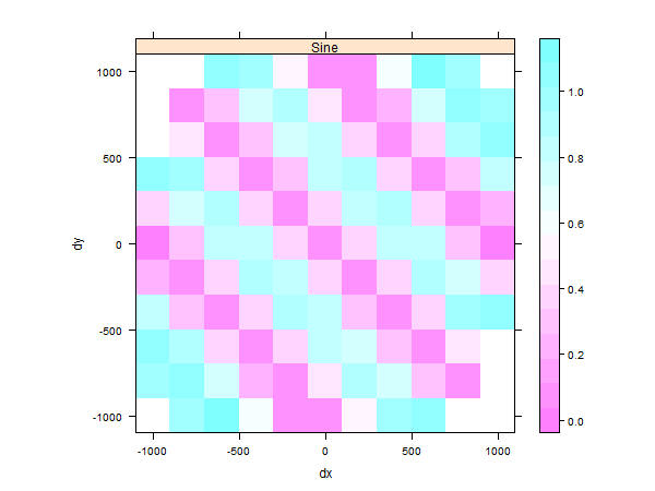
This plot shows there is a stronger autocorrelation between the values along the north-east to south-west axis than in the other directions.
Lets fit a variogram model to this data to examine the results.
# Create directional variograms at 0, 45, 90, 135 degrees from north (y-axis)
TheVariogram <- variogram(TheGStat, alpha=c(0,45,90,135))

# Create a new model
TheModel=vgm(model='Lin' , anis=c(0, 0.5))

# Fit a model to the variogram
FittedModel <- fit.variogram(TheVariogram, model=TheModel)

## plot results:
plot(TheVariogram, model=FittedModel, as.table=TRUE)
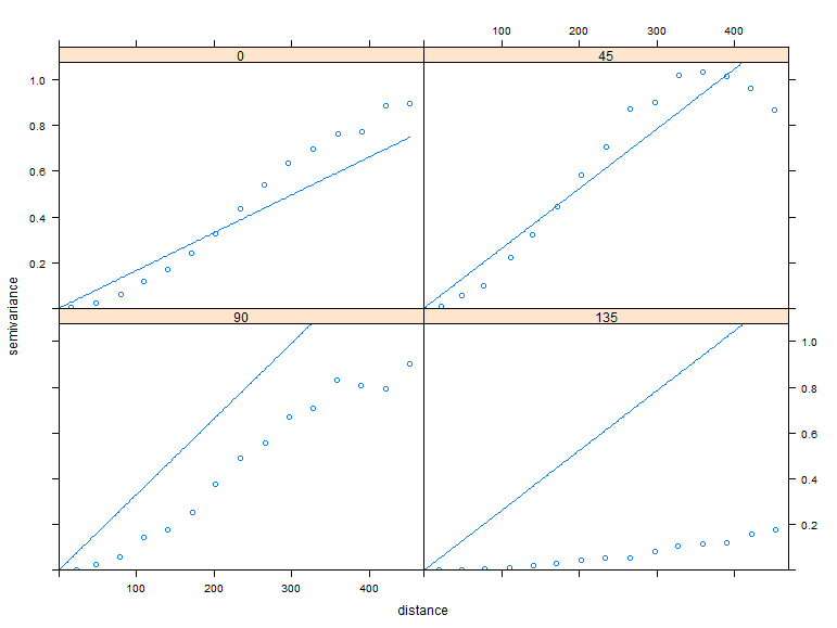
Notice that there is autocorrelation in all the directions except 135 degrees or where you can follow a line where all the values are the same.
Creating Kriged Surfaces
Continuing from the previous section, we'll want to update out "gstat" object.
# update the gstat object:
TheGStat <- gstat(TheGStat, id="Sine", model=FittedModel )
Use the code below and modify it as needed to create a "grid" (raster) to hold the Kriged surface.
# create sequences that represent the center of the columns of pixels
# change "by" to change the resolution of the raster
Columns=seq(from=1, to=1000, by=100)
# And the rows of pixels:
Rows=seq(from=1, to=1000, by=100)
# Create a grid of "Pixels" using x as columns and y as rows
TheGrid <- expand.grid(x=Columns,y=Rows )
# Convert Thegrid to a SpatialPixel class
coordinates(TheGrid) <- ~ x+y
gridded(TheGrid) <- TRUE
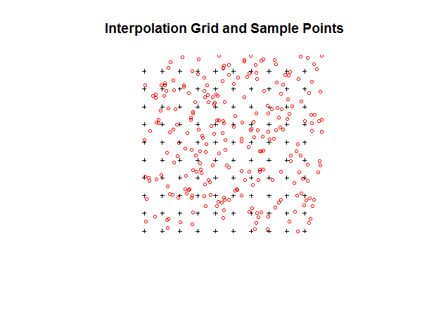
# Plot the grid and points
plot(TheGrid, cex=0.5)
points(TheData, pch=1, col='red', cex=0.7)
title("Interpolation Grid and Sample Points")
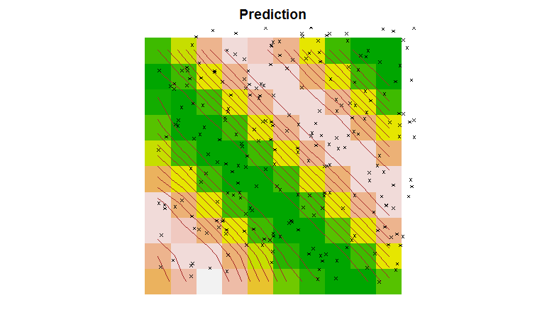
Finally, we can perform Kriging on the data and plot the results.
# perform ordinary kriging prediction:
TheSurface <- predict(TheGStat, model=FittedModel, newdata=TheGrid)

# Set the margins to 2
par(mar=c(2,2,2,2))

# Add the Kriged surface
image(TheSurface, col=terrain.colors(20))

# Add contours to the surface
contour(TheSurface, add=TRUE, drawlabels=FALSE, col='brown')

# Add the points
points(TheData, pch=4, cex=0.5)

# Set the title
title('Prediction')
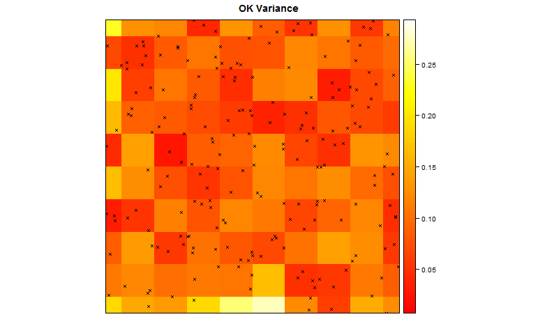
Using R, we can also plot the variance in the surface.
ThePoints = list("sp.points", TheData, pch = 4, col = "black", cex=0.5)
spplot(TheSurface, zcol="Sine.pred", col.regions=terrain.colors(20), cuts=19, sp.layout=list(ThePoints), contour=TRUE, labels=FALSE, pretty=TRUE, col='brown', main='OK Prediction')

## plot the kriging variance as well
spplot(TheSurface, zcol='Sine.var', col.regions=heat.colors(100), cuts=99, main='OK Variance',sp.layout=list(ThePoints) )
Modifying Variograms
You can modify the location of the lags with the "boundaries" parameter:
boundaries=c(0,1,2,3,4,5,6,7,8,9)
Acknowledgements
This section was partially based on information from University of Florida Statistics Department
Other Resources
California Soil Lab Kriging Example
Tutorials on variograms in geoR: Empirical Variograms (just the binned data), Theoretical Models (Fitted Curves)
Tutorials on Kriging in inside-R